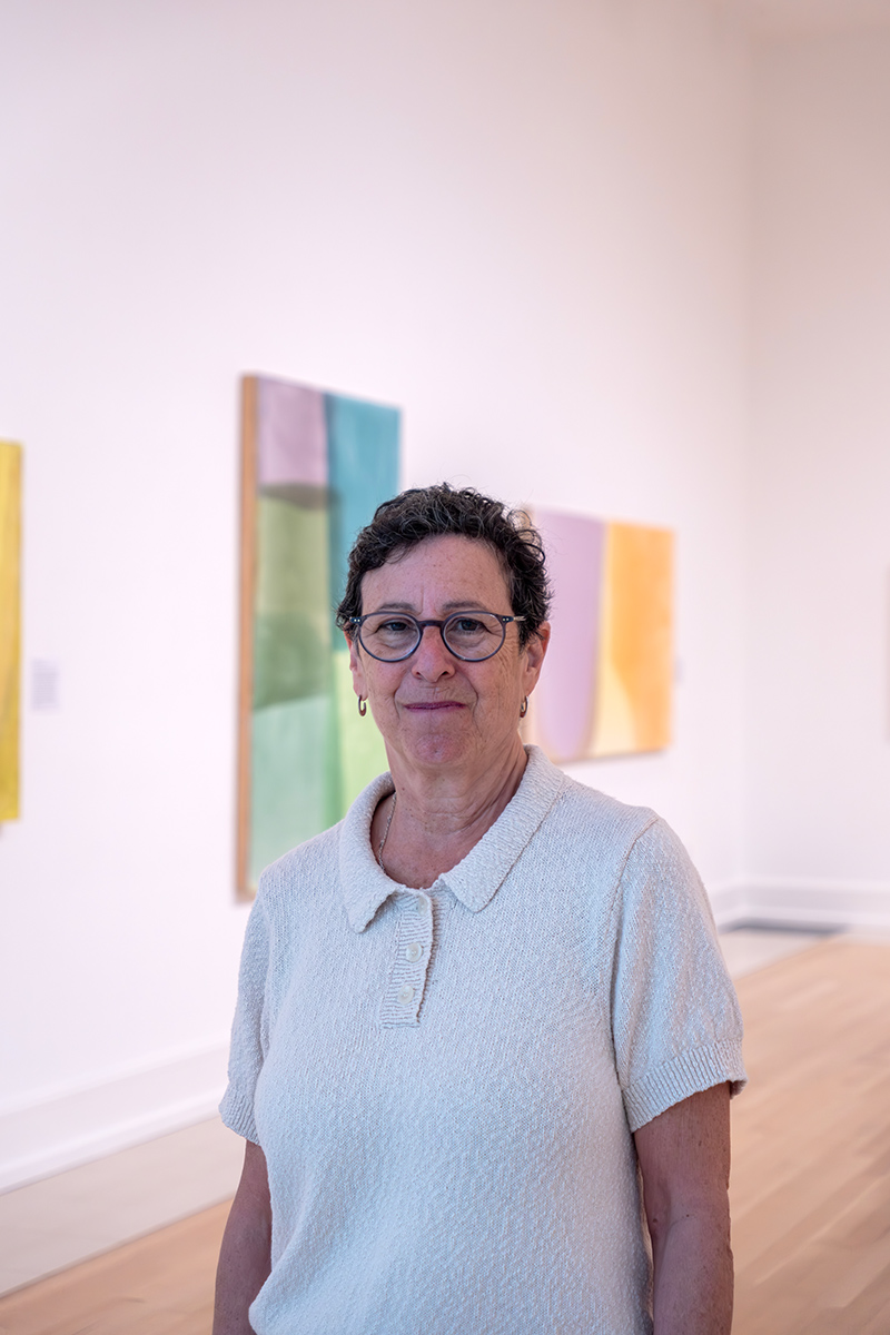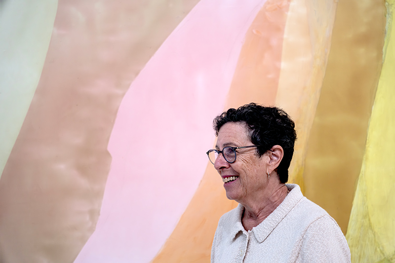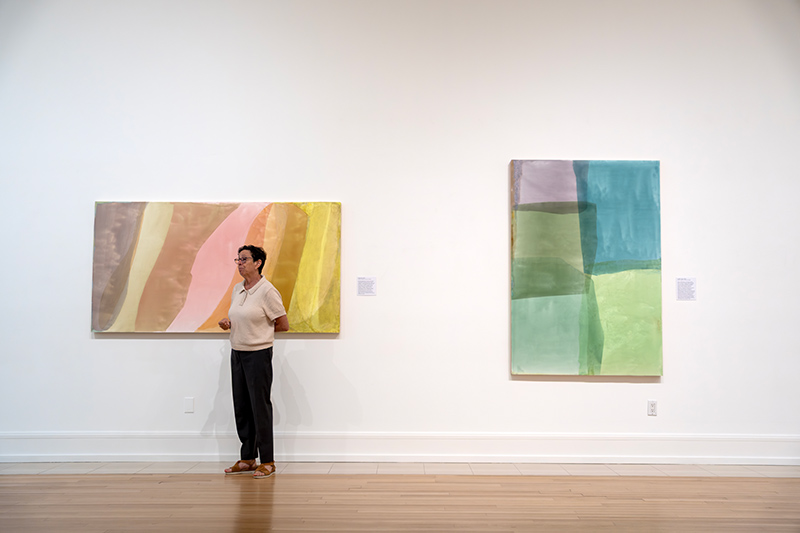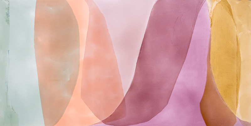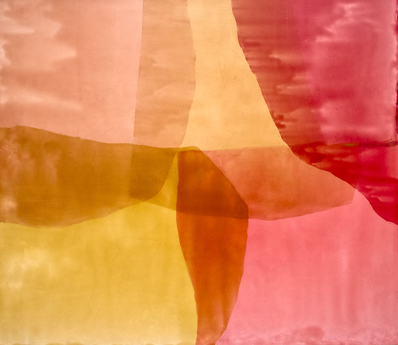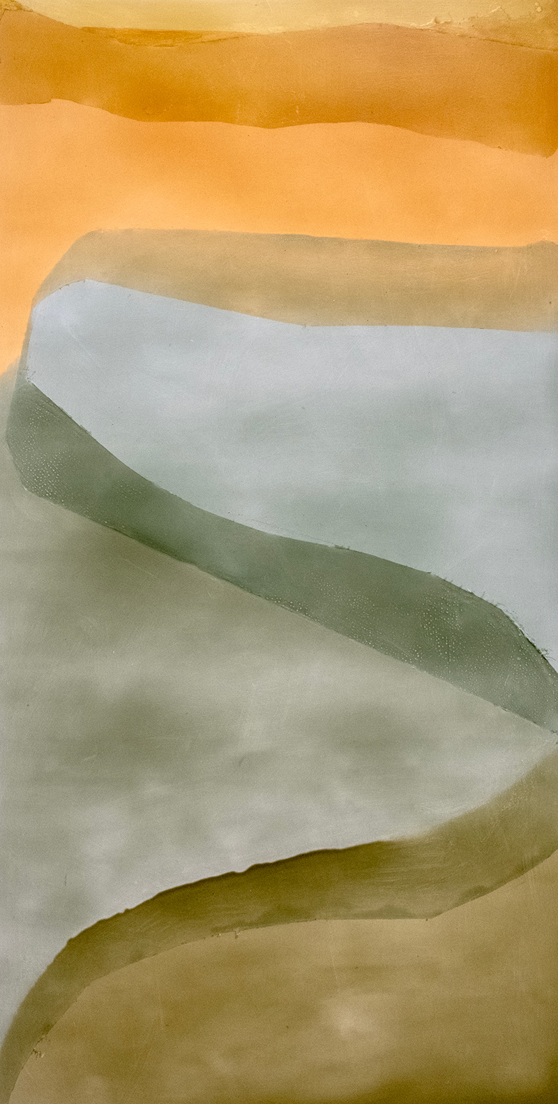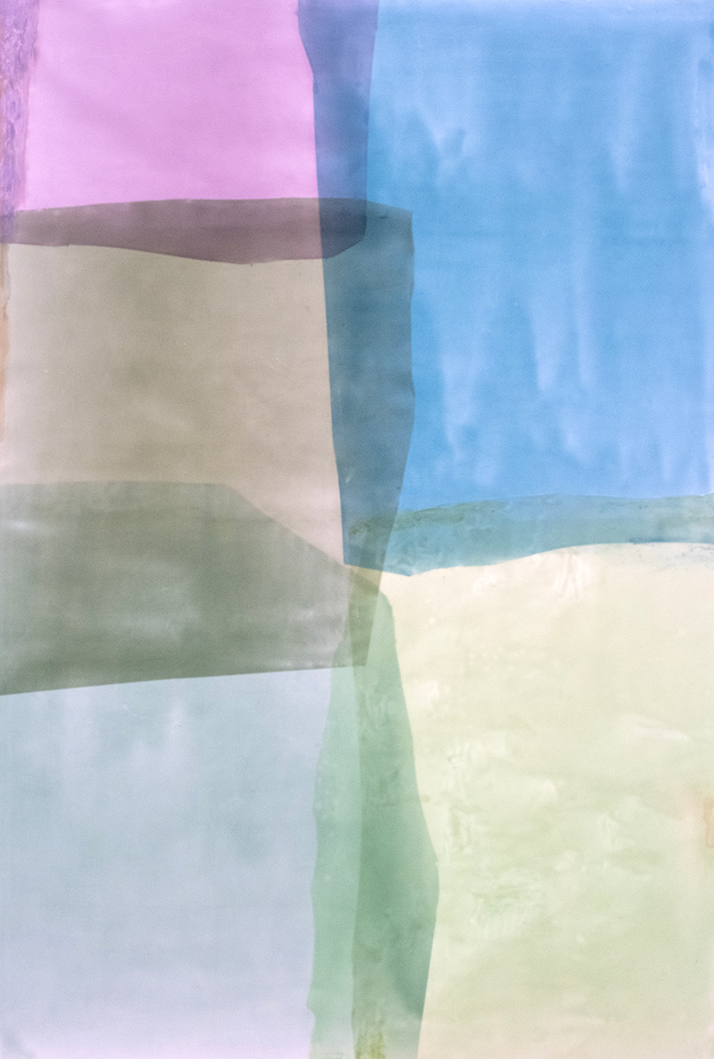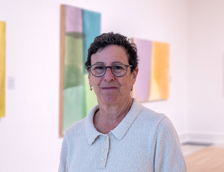
Color takes center stage at the new Jill Nathanson: Chromatic Phrases exhibition at the Vero Beach Museum of Art, on view through Feb. 7.
Nathanson, who lives in New York and has a studio in Hoboken, N.J., began exploring Color Field painting in the 1970s while attending Bennington College, later earning an MFA from Hunter College.
Through her personal connections with acclaimed Color Field painters while at Bennington, she learned how to let colors “call the shots” in determining the composition.
Over the decades, she has continued to expand upon that abstract art style, creating works that invite viewers into visual and emotional experiences.
“My paintings are about very specifically found color relationships, building beautiful and also tense webs across the picture. We feel them visually. I think they’re big enough that you can feel them physically also,” says Nathanson.
She advises viewers to take their time and let their eyes get used to truly seeing and experiencing the colors, adding, “Don’t just walk through this exhibition too quickly.”
Additionally, Caitlin Swindell, VBMA chief curator, says that while viewers often like to imagine images in abstract works, she encourages focusing instead on the emotional response the colors evoke.
“Are you unsettled? Are you calm? What’s so amazing about this work is that you can come back to it so many times, and the color will maybe make you feel differently or you’ll see interactions of color happening in a different way,” Swindell says.
Nathanson uses a translucent, acrylic pouring paint made specifically for her by Bergen Paints, to which she adds specific colors. She then pours instead of brushing the paints onto her given surface, either carefully prepared wooden panels that she sands, seals and primes, or Yupo, a nonabsorbent synthetic paper.
“People think of abstract painting as being sort of free and they can’t believe how much thought and preparation goes into these paintings.”
Her process begins by making a study of the design, choosing from her thousands of color transparency sheets.
“So my planning, my study, is with transparencies. They’re very carefully developed coloristically. It’s the relationships that really make the radiance; one color next to the other color. The overlaps that you see are very much planned,” she explains.
“I spent a very big piece of time trying to find my way to being the colorist I am. And the color has to really hit me; has to really impact me. It could take me a really long time to get to something that feels like it’s worth investing as much trouble in. And once I have that thing, I’ll invest the trouble.”
Despite following those carefully developed studies, she says the act of pouring introduces an immediate, responsive element to the process.
“Each shape I do in a day. I tape it out, I pour it, and it fills that shape and makes kind of a radiant puddle. It takes overnight to dry. So every single one of these colors in here has been basically a day of work, which is ridiculous, but it works.”
To add emphasis, Nathanson likes to brush in areas of oil paint at the end.
“It adds more scale; it adds a different texture. It complicates the painting a little bit. Sometimes I notice that they need to have a change in texture.”
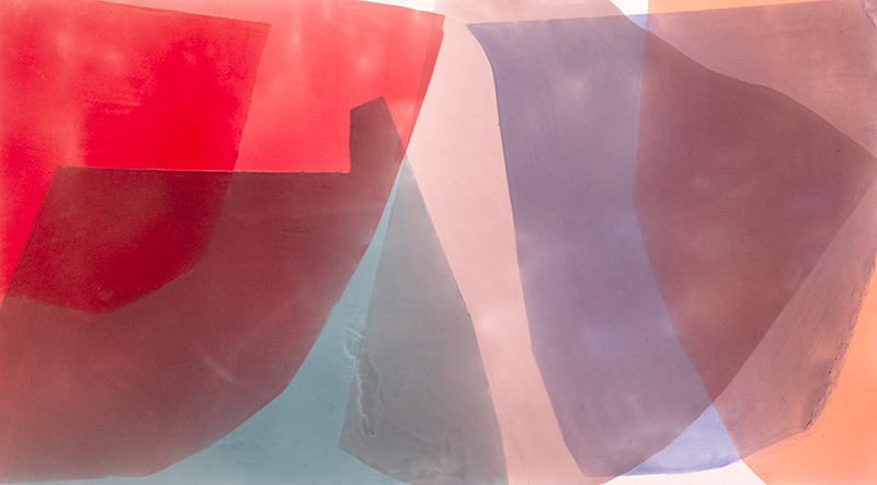
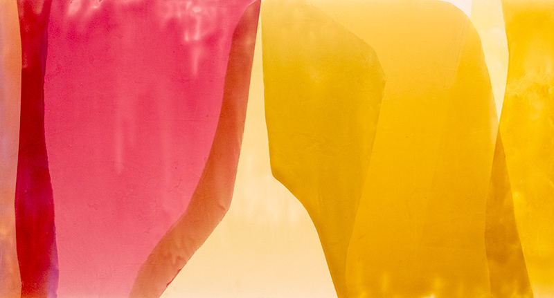
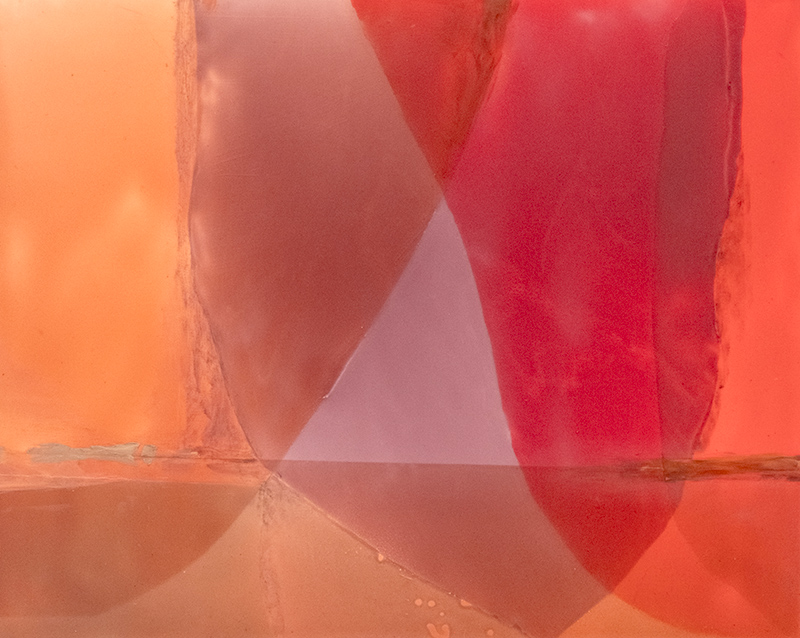
Discussing “Ricochet” 2025, Nathanson explains that she used only four colors, yet their layered overlaps create the impression of a much broader palette.
“One of the things that’s very key here is the yellow is kind of coming forward; it’s very radiant.
But the colors that are on top of it are pressing it back. All this overlapping is to add a kind of pressure and tension. So it’s kind of a language of openness and beauty, but also pressure and tension. And to me, that’s how the expression really occurs in the paintings,” Nathanson explains.
“I do think that you see a painting first in one way, and then, once you’ve taken the time to look at the parts of it, I think it comes together all at once in a different way.”
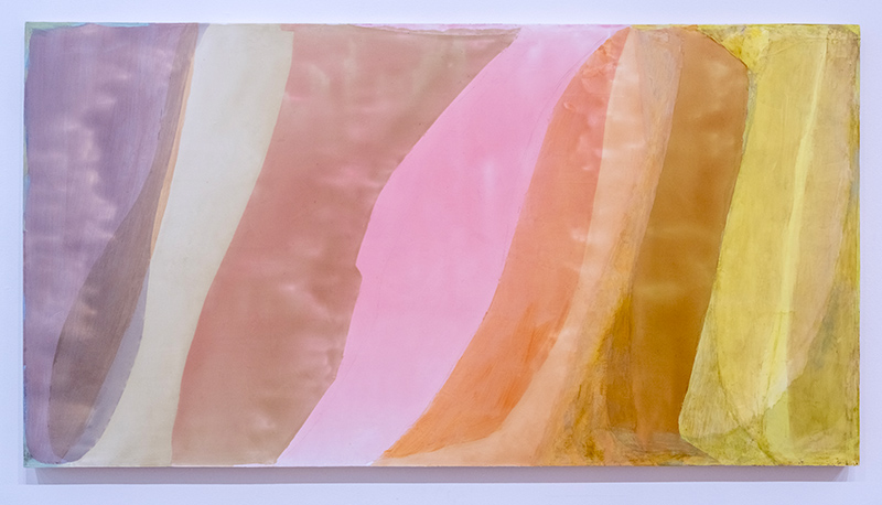
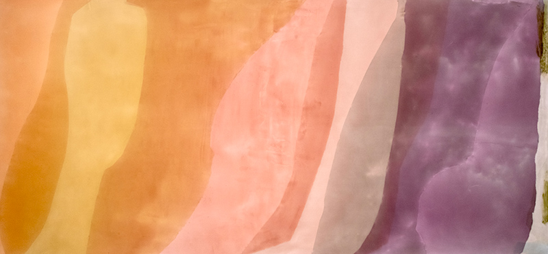
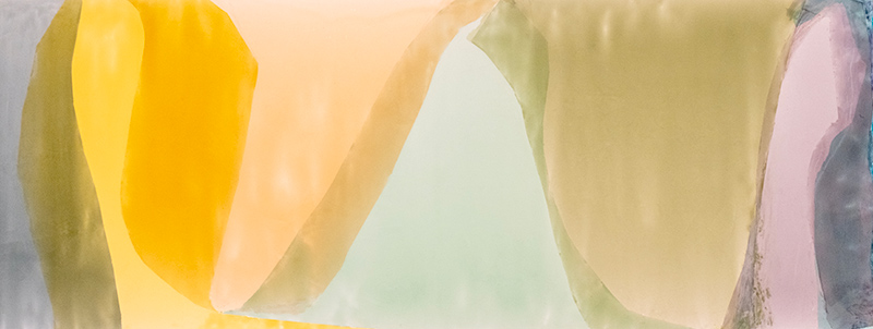
An example is “Psalm Harp” 2024, where ribbons of color move fluidly across an expansive rectangular field.
“It has this kind of flowy drawing that goes across, but you can see that it’s also very constrained and pressurized on the sides. So, again, the yellow is coming out and it’s being pushed back.
There’s this openness, and then things being pressurized back. It’s not like a pretty painting; I don’t want that. It’s a kind of beauty that is more like life,” says Nathanson.
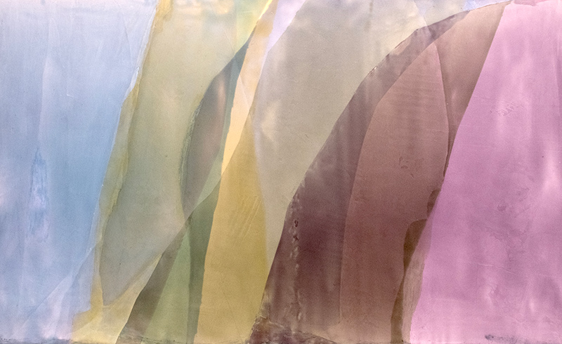
Rather than follow the tradition of placing complementary colors side by side, she prefers to position them on opposite sides of her paintings, as with “Untitled” 2024, with yellow on the left and its complementary color, purple, on the right.
“I’m trying to get you to move across the picture to complete the color spectrum.”
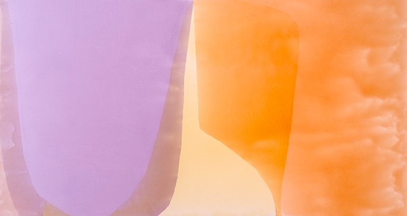
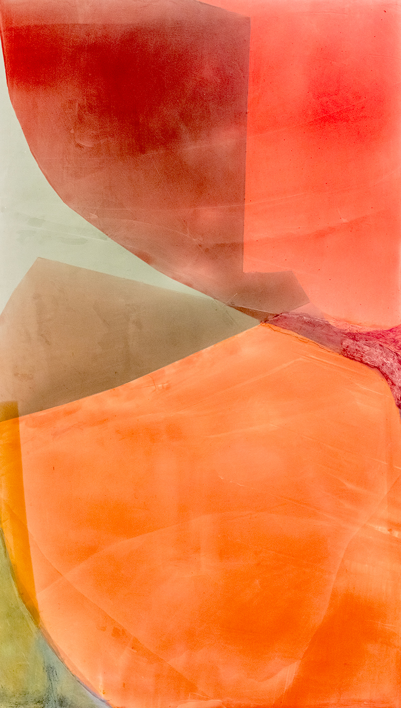
Nathanson also explores atypical color relationships, such as the purples and oranges in “Breathtouch” 2025.
“These are not colors that are supposed to go together. So to come up with that sequence took a lot of doing. I copied that study but then the way that it got darker here, darker there, or a little lighter in there. There’s no way that I did that on purpose. That just happened and it’s gorgeous.”
Although Color Field painting had fallen out of fashion by the time she graduated from college, she felt it was important and profound enough that she wanted to move it ahead.
“I thought this would take me a couple of years. Instead it’s been 40 some odd,” says Nathanson with a laugh.
“So, the experience as an artist, I’ve been out there long enough without huge rewards, but the reward is in the studio. The reward is in the thrill of finding the relationships that I want to paint.”
For more information, visit VBMuseum.org.
Photos by Joshua Kodis