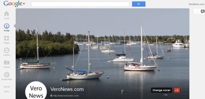
Don’t get me wrong, I like strong visuals. I’ve been a photographer for over 13 years and there’s nothing like seeing your work large on the screen or in print, but Google+ has gone a little crazy with their cover photo redesign.
The dimensions of the new photo on your Google+ page is 2120×1192 pixels.
If you haven’t check your Google+ page in a while, or like a lot of people, don’t have one, the photo takes up most of you screen.
At first it was smaller than the faebook cover photo in the timeline redesign. It appears Google has upped the ante with this new profile design.
What do you think about it? Do you like it?


