
If his activities during the sweltering days of summer are any indication, Vero Beach-based artist Barry Shapiro must have gotten straight A’s for his boyhood “What I did during summer vacation” essays.
When not spending time in the downtown storefront he shares with three other artists, Shapiro has been working on a 52-foot-long mural on the studio’s exterior wall.
For Shapiro, the mural is a labor of love; he is not receiving a cent for his artistic labors. The owner of the building is completely on board with the decoration, even paying for the paint that Shapiro and his assistant, Susan Grace Ocana, are using to execute the mural.
As in real estate, location is key to placing a mural before the public eye. Let’s say that this mural is more of a destination than a drive-by.
“It’s a great wall, but it is not highly visible. Sort of in an alley,” says Shapiro.
Located on the west side of the building, Shapiro’s mural faces away from the traffic that zooms past it on west-bound Route 60 (aka 20th St. or Twin Pairs). To appreciate it, the mural is best seen on foot, up-close and personal.
The wall is in a walkway between 1422 20th St. (known to the artists within as Studio on 60) and The Pipe Den. From the sidewalk on 20th Street, the passage leads to a semi-restricted parking lot behind the 14th Avenue businesses. The mural, as well as the back entrance to Studio on 60, can also be reached via that lot.
“When I moved into this studio, I knew immediately I wanted to do something with the exterior wall,” says Shapiro.
Executed in 19th century Japanese woodblock style, the colorful mural depicts a geisha holding a modern-day paper hot-cup, onto which Shapiro has painted the logo of a to-be-opened coffee shop in the same building. Down the wall from the geisha, past a gnarled tree embraced by an octopus, a grimacing kabuki theater hero consults his mobile device. Its screen displays the geisha’s face.
“I’ve always had a fascination with Asian art,” says Shapiro, who credits his inspiration for the mural to his art history studies in college, travels in Asia, and his collection of vintage Japanese wood cut prints.
The mural is not Shapiro’s only project. He has also been working on a book cover illustration and is negotiating a commission for a local financial corporation.
Shapiro notes that all the aforementioned projects are “totally, completely, different” from the paintings he has lately been doing for himself. These are part of a new landscape-inspired abstract series that will intrigue the ever-searching artist until the next brainstorm takes him in a new direction.
Because his studio mates are either away for the summer or working from home studios for the duration, Shapiro has been alone in Studio on 60, practically since the COVID-19 lockdown began.
“I was in here by myself, listening to a lot of Bob Dylan,” he says.
For the past few months, like the rest of us, Shapiro has been following the news about outbreaks in our country, both coronavirus and civil unrest. After George Floyd’s death, he saw marchers pass by the studio’s plate glass window on their way to an anti-violence rally on the county courthouse steps two blocks away, and joined the vigil.
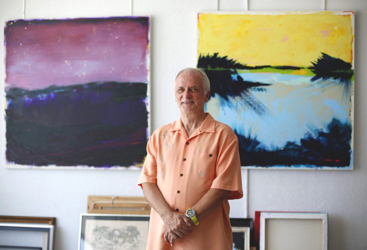
Standing in front of a 36-inch-high-by-60-inch-wide painting on canvas, propped on two studio easels, Shapiro introduces his “Sea Change.”
“Right now there is a sea change going on,” he explains. “The protests are where this painting came from.”
His acrylic painting depicts a turbulent, black sea under a gray sky. On the horizon appears a line of green and yellow strokes. Do they imply a safe harbor in the distance or are they merely a continuation of the angry sea?
Aesthetically speaking, Shapiro is particularly happy with the differing textures he used in the lower portion of his canvas, where rough black patches of sea appear amid smoothly painted ones.
The secret, he says, is a product called fiber paste, a gel with paper fibers in it that can be mixed with acrylic paint of any color and applied to canvas or board. Because smooth areas of paint look shiny in relation to the dry areas of fiber paste, Shapiro sprays his finished works with matte artist’s varnish to “make everything a bit more uniform.”
“The largest piece I did before this is over here. This was at the beginning of the coronavirus isolation period,” he says.
That 48-inch-square canvas, titled “Desolation Cove,” is one of the first paintings on which Shapiro used fiber paste.
It shows a dark sea in colors of purple, black and dark green, over which a wine-dark sky prevails, where tiny yellow dots stand in for stars. A syncopated lineup of red dots glows at the horizon’s edge. Here again, Shapiro toys with our imagination. Do the latter represent a distant shipping lane or possibly the glimmer of a great city just beyond the world’s edge?
Shapiro says his nighttime scene began with much brighter colors.
“I usually start with one color that I apply to the canvas with a silicon wedge (a flexible spatula held directly in the hand). The bottom color on this canvas is light blue.”
Scarcely a hint of that benign color remains.
Though low key, the colors in “Desolation Cove” seem to float a fraction of an inch above the canvas. If that reminds you of the late Mark Rothko’s ephemeral two-color paintings, you are not far off.
Shapiro sees the resemblance, but for him it’s a “no cigar” comparison. The work is not totally abstract, as Rothko’s are. Rothko considered himself a sort of artist-priest, whose alchemy of colors on canvas could (and can still) induce a state of trance and even tears in his audience.
Shapiro considers himself an artist. He thinks of his recent series as abstract landscapes intended to engage viewers intellectually and emotionally, but weeping is optional.
He started what he calls this “landscapey thing” early this year.
“I was very excited about it, and thought the set decorator I have worked with in the past would buy one, perhaps two of them.”
That set decorator, Beth Kushnick, is a friend who goes back with Shapiro to his television commercial producing days, decades ago in New York City. Among her purchases of Barry’s work have been two works on paper, black and white forest scenes in charcoal and pastel, for a CBS detective series called “Monk,” and a landscape painting for a CBS political satire called “Brain Dead.”
Shapiro at first hoped CBS would want a couple of his newest paintings for “The Good Fight.”
“Beth got back to me and said she couldn’t buy any of them because they looked ‘too much like a Rothko,’” he says.
According to Shapiro, CBS had earlier gotten into a bit of hot water with somebody representing Rothko’s artistic reputation. That party asserted that some other artist’s painting that appeared on a CBS show “looked too much like a Rothko,” and wanted it removed from the set.
Now that’s enough to make you weep.