
A selection of American prints is on display through Sept. 23 in the Titelman Gallery of the Vero Beach Museum of Art.
“Post-War Impressions: Printmaking in the United States after World War II” is a selection of artworks chosen by VBMA curator Danielle Johnson from the museum’s collection of 272 prints.
Johnson says that when she was looking through the flat files to decide on a checklist, she found the post-World War II printmaking collection particularly robust.
“It really it reflects the explosion in the print industry after the ’60s,” she says.
That explosion included a number of techniques, both old and new, that artists felt free to use, including lithography, woodcut, mezzotint and etching.
There are also techniques on display you may not have heard of, including serigraphy, siligraphy and collography. Serigraphy refers to the screen printing process which, by the 1950s, was becoming known as a fine art medium rather than a commercial one. Siligraphy, also known as waterless lithography, uses silicone to selectively repel and attract ink on different parts of a printing support; the result resembles a lithograph. In collography (also spelled collagraphy), the artist creates a low relief collage on the printing support, which is then inked. Transferred in an intaglio press onto paper, the ink from the collage creates a print with rich visual texture.
There is one print in the exhibition whose technique will be familiar to anyone who has ever ironed their favorite cotton shirt on too high a setting.
Artist Rudolph Montanez’s “…That Pass in the Night” of 1979 is composed of scorch marks from electric steam irons on paper. The sienna-colored burns are from the soleplates of two different irons, placed side by side on the paper, pointy end up.
“It was fun for me to bring this one out,” says Johnson, who laughs as she points out that the print is notated as an artist’s proof in its lower left margin.
That might make you wonder if the artist made, or had the intention to make, an edition from this prototype.
Despite the humor inherent in its offbeat process, there is also a certain ruefulness about these monochrome brandings, placed just so on the paper. As the title suggests, they look something like the bottoms of two parallel boats. Rather than passing in the night, however, the marks evidence the fateful moment when hot iron met paper.
In her label for the print, curator Johnson wrote that the technique “reflects the openness of the art community to new techniques and effects, particularly from the 1960s onward.”
Not a lot is known about the artist of this piece. Born in 1941, Montanez graduated with an MFA in Sculpture in 1972 from California State University in Fresno. After moving to New York City, he exhibited at the 1975 Whitney Biennial and was included in four group shows at MoMA PS1 in 1977 and 1978. The trail of his exhibition career goes cold after 1985. Montanez retired from a 30-year career teaching art in New York’s public school system about 2011.
The source of the print in the VBMA collection was the Alternative Museum, an arts institution devoted to showing new work by underrepresented artists. Founded in 1975, the museum moved several times, finally shutting its doors in 2000 in favor of an online presence. In 1990, after its board decided the museum would be an exhibiting and educational institution only, the Alternative Museum’s collection of artworks was dispersed. The then-Vero Beach Center for the Arts received the gift of 85 of paintings, drawings and prints from it.
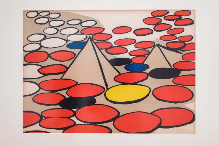
Other prints currently on display are by very well-known artists, including Romare Bearden, Jasper Johns, James Rosenquist and Andy Warhol. Also in the show, a 1992 Richard Diebenkorn print titled “High Green, Version II” is the promised gift of David and Georgia Welles.
While those names would be a feather in any museum’s cap, the works of lesser known artists from the VBMA collection present a strong showing next to the production of their more famous colleagues.
Take, for example, “Structure of a Dream,” the painterly, 95-color serigraph on display by Mahopac, N.Y.-based Larry Dinkin.
“When I first saw it in storage, it looked like a painting — it’s so lush, so dense — and that’s obviously a product of the number of screens used to produce the print,” says Johnson.
The print’s imagery hints at all sorts of industrial environments, from the interior of a warehouse to the structure of a highway overpass.
Dinkin, notes Johnson, is not primarily a printmaker, but a painter. “Structure of a Dream” is based on one of his paintings. Under his supervision, the serigraph was made in 1995 at Fine Art Printing in Long Island City, N.Y.
Born in Brooklyn in 1943, the artist took his training in New York City at Pratt Institute and the School of Visual Arts after minoring in art at City College of New York (where he earned a B.A. in Sociology and Anthropology). Dinkin subsequently made a name for himself the as the founder of International Food Marketing, a New Jersey-based advertising firm that marketed frozen foods. He gained one of his biggest accounts, Marie Callendar, in 1988. Before he retired from the position in 1994, Dinkin served as president of that company.
Not everything in the Titelman Gallery has its origins in New York, however.
“A few of the prints here are from the Midwest,” notes Johnson.
Many of those were the 2000 gift of sculptor Harvey K. Littleton, who at the time wintered on the Treasure Coast. A retired professor of art, Littleton was affiliated with the University of Wisconsin-Madison, where he installed the country’s first hot glass studio. Known as the Father of the Studio Glass Movement, his 1988 sculpture “Blue Sliced Descending Form” was purchased by the VBMA for its collection in 2008.
Some of Littleton’s gifts to the museum were created by his teaching colleagues in Madison. They include Warrington Colescott, whose 1966 intaglio print 1966 “Dillinger: The Great Mason City Raid” is on display. The gentle surrealist John Wilde, another of Littleton’s colleagues, is represented in the show by his lithograph “Wildeview” of 1985.
Littleton also received prints from artists he invited to create prints at his North Carolina Studios. His print atelier produced intaglio and siligraph prints using glass plates as printing matrixes. Littleton coined the word “vitreograph” to designate a printed image pulled from a sandblasted, acid-etched or siligraph processed glass plate.
Prints originally given to Littleton as a token of friendship are also here. One of them is the Oregon-based Margaret Prentice, whose 1992 wood cut on handmade paper, “Flying Dream,” was produced as part of a commission for the Oregon prison system.
The print’s theme is escape; it shows prisoners being propelled to freedom by the powerful jet of a magic fountain.
It’s a very serious idea for an artwork that was for a jail facility, but she managed to make it something very fun and playful.”